Prototyping
User testing of Rent.ie had highlighted that adding a save ad button to the listings and advert pages would allow users to find their preferred ads more quickly. Expanding on this idea a save button was added to the home page search box. This allows users to save their search terms so that each time they revisit the site their search is saved so that they do not have to reenter the same information repeatedly as users are likely to perform the same searches repeatedly as their constraints such as budget are unlikely to change.
Home Page
Beginning with the Home page of Rent.ie a list of the standard elements such as app logo, buttons, links and search boxes was prepared. Rearranging these elements, to quickly prototype new layouts with the same base elements. Evaluating and improving on each of
these cycles, the low fidelity prototype was finalised.


The original site has a black background which darkens the whole site. The background was changed to white, which is more in line with modern web design in general. It also makes the site brighter and more welcoming.


As the colours of the logo are blue and green, this was chosen as a restricted color palette. The row of tabs / categories was moved to the header and superfluous links were removed as was the ‘cartoonish’ imagery. Instead photos of pleasant home interiors were used. This again was in keeping with what can be seen across similar sites. Having the user immediately engaged by examples of accommodation they could rent grants a sense they have found the site that will usher them to their new dream home.
Search box
The existing search box is a black rectangle with several lines of white text of varying proportions, five white fields and a light blue search button. Each of the input fields is preceded by a label and all are populated with black text. The fields differ unnecessarily, with the ‘Area’ field taking up a disproportionate amount of space relative to its function.


Carrying over the search box to the prototype the background colour was changed from black to light blue. The white text from the search box was changed to green to reflect the colours in the Rent.ie logo. For the five input fields the titling of each field was removed instead,
having the default text inside the field describe itself. (Fig 3.6) Each field would have a drop-down menu. The County and Area fields were amalgamated into a single field with the label “Location +0km” inside. The previously mentioned Save button was added so that users
can save their search terms. The search box was divided up in a more even fashion, each field now has the same height. The “Location” field was given more horizontal space to incorporate the larger amount of text required as opposed to the price and bedroom fields.
Listings page
Similar to the search box, the existing elements of the listings page were rearranged with design principles, usability and clarity in mind. The redesigned listing page follows the same color palate as the landing page for consistency. A landscape version of the search box with the same styling and proportions was added to the header to allow users to modify their search terms without having to return to the landing page. Feedback from user testing of Rent.ie indicated that images of the property are what users are most interested in seeing, with that in mind, the images on the ad were scaled up and the amount of text was pared back to facilitate quick scanning by users as opposed to overloading them with detail that is duplicated on the individual ad page. A save button was added to each result to allow for
quick saving of ads for later evaluation.

Advertisement Page
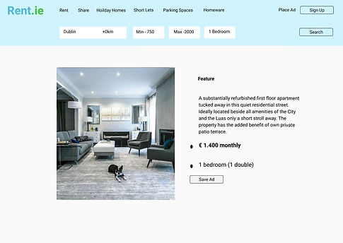
The existing advertisement page was restructured following a similar methodology to the landing page, search box and listings page. The
required elements were extracted and rearranged to convey the most pertinent information to the user first, the color palette was updated and the search bar included to remain consistent with the listing page. The consistent search bar will provide users with the psychological safety of being able to modify their search terms whenever they see fit. The information regarding the property was reorganised to highlight what is immediately important to the user, such as price, features and photos. With information less relevant to browsing such as estate agent details pushed lower down the page as this is not relevant until the user has actually selected a property to rent / buy.


Wire frame
Using Figma a wireframe model of Rent.ie was constructed. In this wire frame prototype, design principles were followed to identify what elements of the site work and what elements needed to be updated.
