Iterative/redesign
Feedback gained from user tests was incorporated to refine the wireframe prototype into an improved iteration.
Landing Page
● As the feedback in relation to the colour scheme was overwhelmingly positive, this was expanded throughout the wireframe prototype changing the background from white to light blue.
● The hero image on the homepage was enlarged, allowing it to take up almost the whole screen.
● Removing the search box and using the search bar from the listing and advertisement pages. This made the search functionality consistent across the whole site. This was a suggestion from the user testing and appeared in competitor comparisons.
● The search bar crosses the hero image a little above halfway. The search bar was broken into two sections; top and bottom. The top being a blue rectangle with white text that extends the width of the screen and the bottom being a lighter blue rectangle with three white fields and a blue button. The bottom section of the search bar occupies the middle of the screen but does not extend to the edges making it more prominent.
● The search bar has an opacity of 75 percent to not fully obscure the image.
● A blue bar was added to the header and footer to reflect the search bar and give the landing page a sense of symmetry.
● Example properties were added to the bottom of the home page.
● The save function on the home page was dropped as it was discovered to be cumbersome and difficult during user testing.


Listings page
● On the listings page the search bar moves to under the header with a save button added so users could save their search term. More consideration was given to how the save button would look and how it would change depending on state. The save button provides the user with a sense of control over the saving process, removing the uncertainty of putting the trust in the machine.
● Save and favorite buttons are widely used across the internet with the heart symbol being commonly used to denote this. As such it was decided to use the word `Save` and a heart symbol `♡` as text on the save button. When the ad is saved the heart symbol changes from an outline to a filled red heart `❤️️`.
● A back button was added following feedback from the user testing.
● The layout of the adverts on the listing page was changed to give more space to the image of each property while not obscuring other adverts.


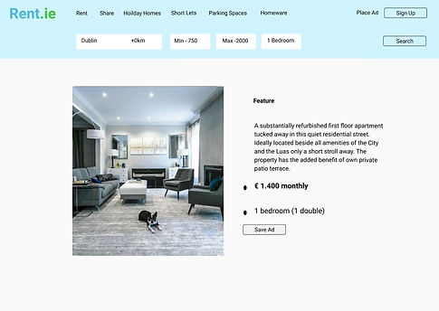
Advertisement Page
● Additional property images and more details regarding the property. The secondary images of the property were enlarged as photos were the primary focal point of any user.
● A map was embedded in the ad showing the property’s location as a user unfamiliar with the city in which they were searching would not have significant local knowledge.